
ROKU GIN ZERO
A zero alcohol alternative that embraces the traditions of the original
UNIVERSITY PROJECT GRADE
HIGH DISTINCTION ( 92 )
PROJECT YEAR
2025
PROJECT TYPE
VISUAL IDENTITY DESIGN PACKAGING DESIGN ANIMATION
OVERVIEW
Roku Gin Zero is an alcohol alternative from the standard Roku Gin. This university assignment tasked me to create a unique visual identity for this alternative version targeted for those aged 18 - 25. Younger Australians of legal drinking age are turning to non-alcoholic alternatives more and more today, prioritising their health and wellbeing.
CHALLENGE
This university project challenged me to take an established Global Suntory Spirit and reimagine them as a non alcoholic offering that takes a brand identity that targets a younger demographic and speaks on their new position whilst honoring the features of the original brand.
SOLUTION
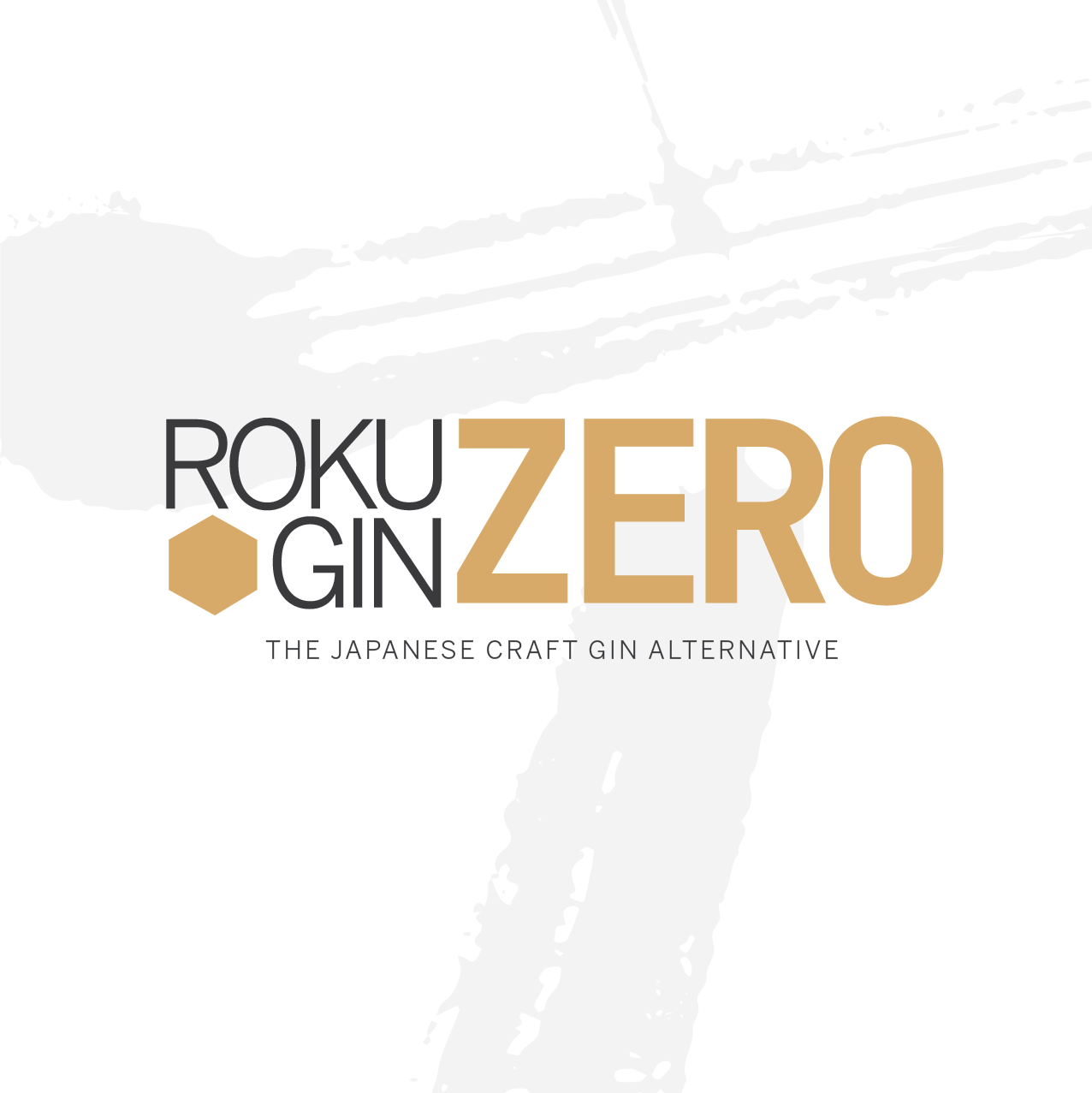
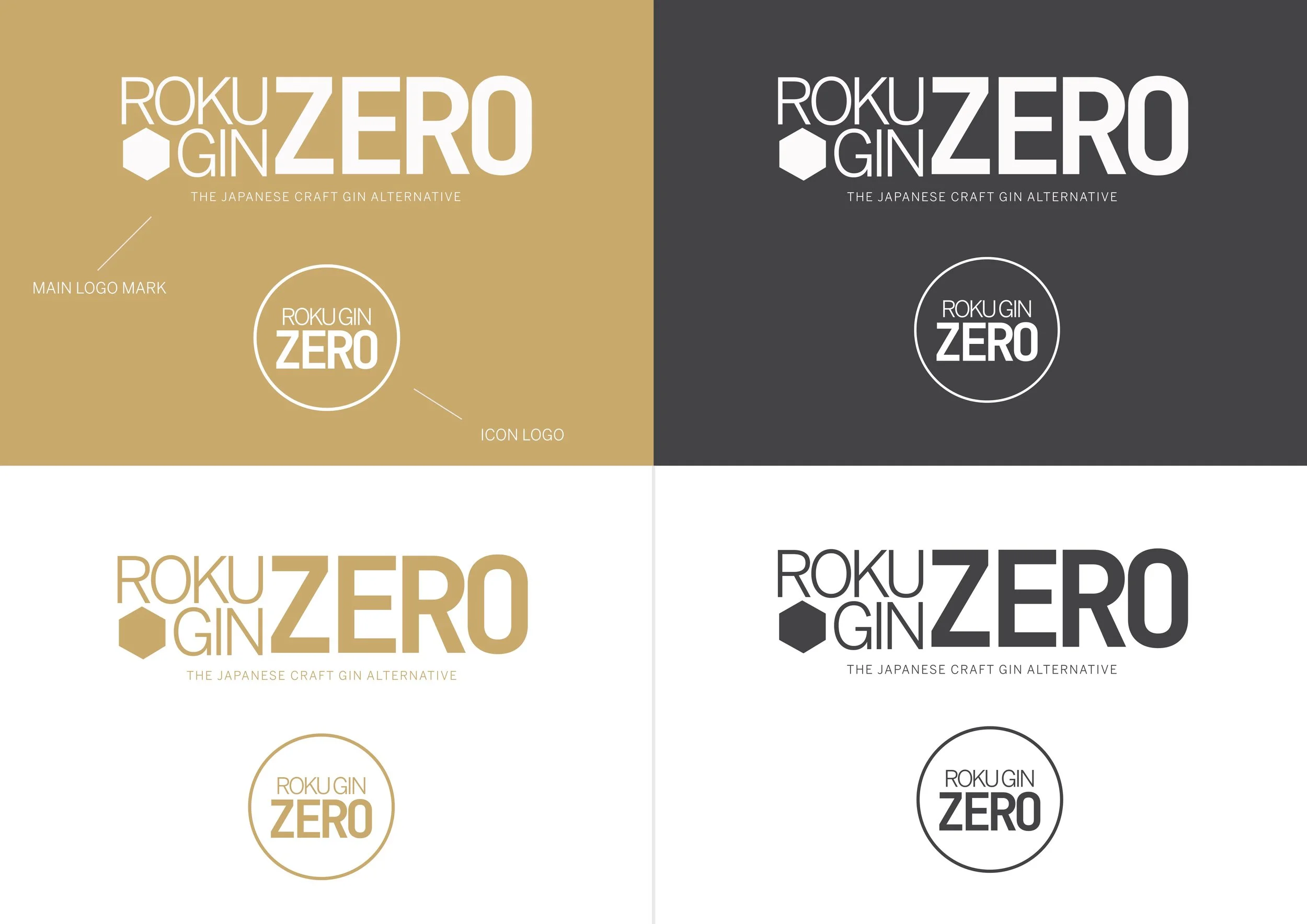
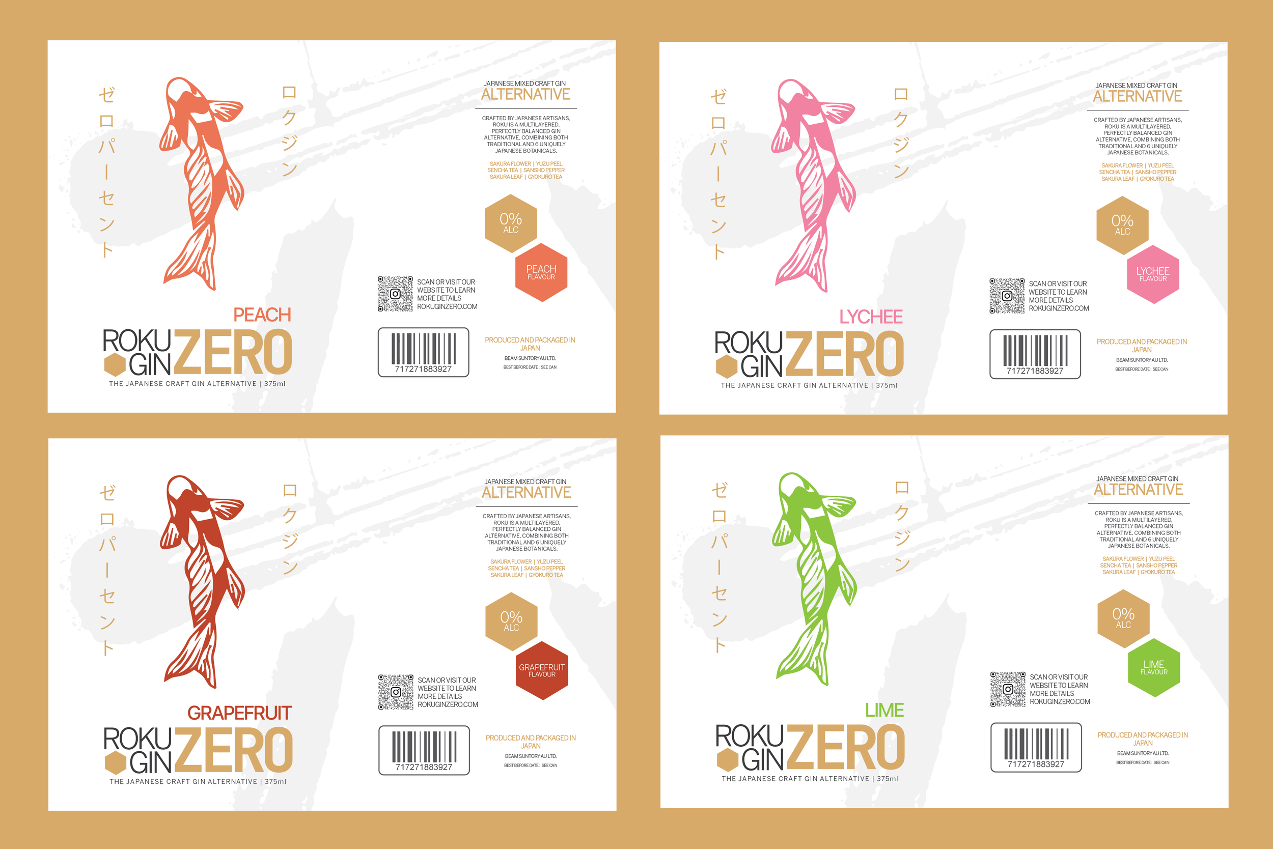
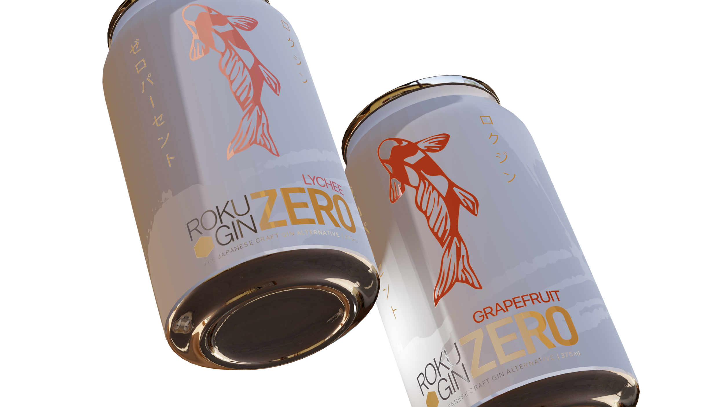
The primary logo is built around the text and a hexagon, a shape that is synonymous to the current Roku Gin brand. The 6 sides are meant to represent the 6 botanical elements used in the creation of the Japanese gin, carrying this element over into the zero alcohol connects this identity to its parent brand.
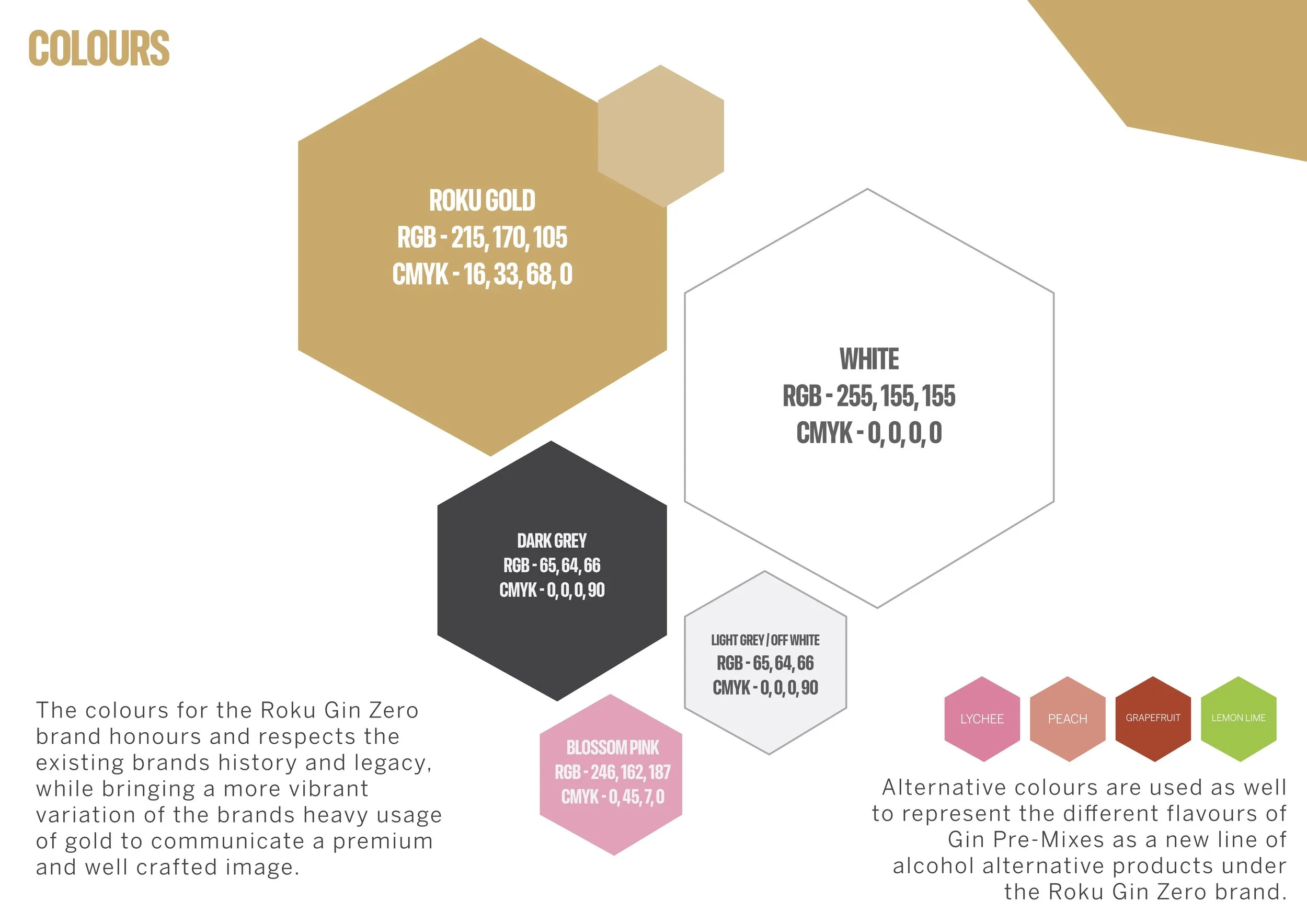
Many alcoholic alternatives use the colour blue to signal the absence of alcohol, to maintain the refined look of the brand, I decided to avoid using blue and instead made the word “Zero” the largest element in the logo. The Roku Gin streak symbol is used within the parent brand’s logo and serves as a recognizable symbol of the brand. Roku Gin Zero leaves this streak out of the main logo to maintain a sleek look. However, the symbol is used within backgrounds to add depth to various brand collateral.
This new visual identity uses modern sans serifs and Suntory’s Roku Gin primary and secondary colours to achieve a modern yet sophisticated look while it again maintains its connection to the parent brand.